Design System Rework
Moving the Mutual of Omaha design system from Sketch to Figma
Role: UX Visual Designer
Toolkits used: Figma & Sketch (moved existing system to Figma)
Why the rework?
The goal was to update from our current designer toolkit, Sketch, to a more designer-friendly Figma. A major part of this rework involved creating new libraries for icons, illustrations, colors, and typography while maintaining the current design system component library (such as buttons, brand components, etc).
These libraries would go on to be used by all of the designers at Mutual of Omaha in every design project going forward and later expanded into separate libraries for other Mutual of Omaha brands such as Wild Kingdom.
Challenges to solve
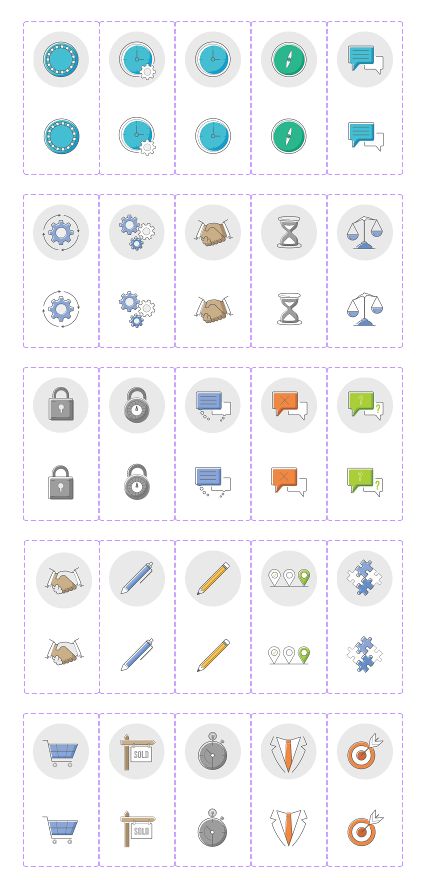
New illustration library components (partial)
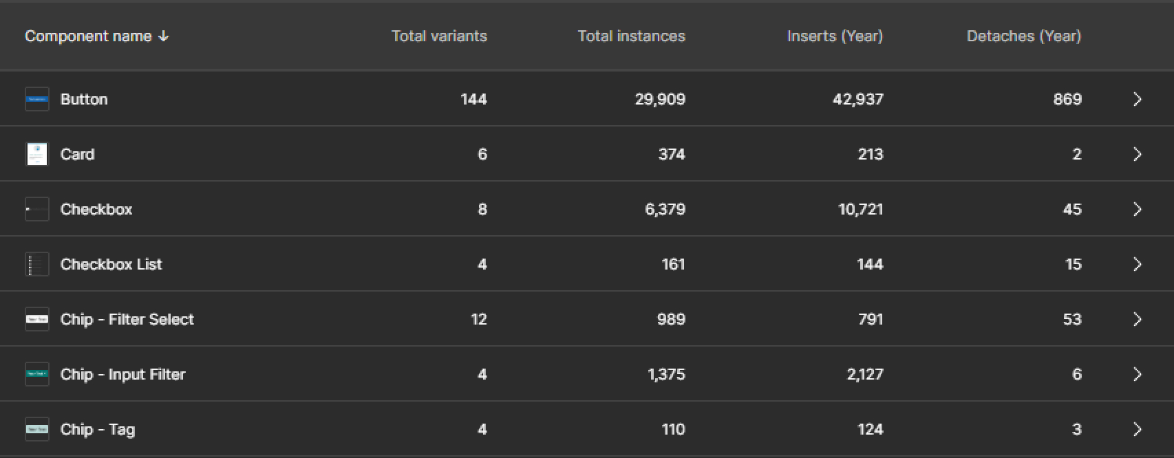
High Detach Rate
Within Sketch, there was a 90%+ detach rate. This made keeping the brand consistency and technical debt incredibly hard to maintain. Because of this issue, different brands were actually creating their own libraries outside of the main design system.
Needed Proper Documentation
When trying to design in Sketch, designers were unable to understand what some of the more complex components should be used for.
Improper Libraries
Some of the libraries in Sketch needed to be separated out to be easier to use and speed up the load speed whenever a designer wanted to try and update a specific library.
Multiple Platform Support
The new design system needed to support many brands without the need for other libraries to help with keeping consistency across all of Mutual of Omaha.
Creating the libraries and components
Color & text styles
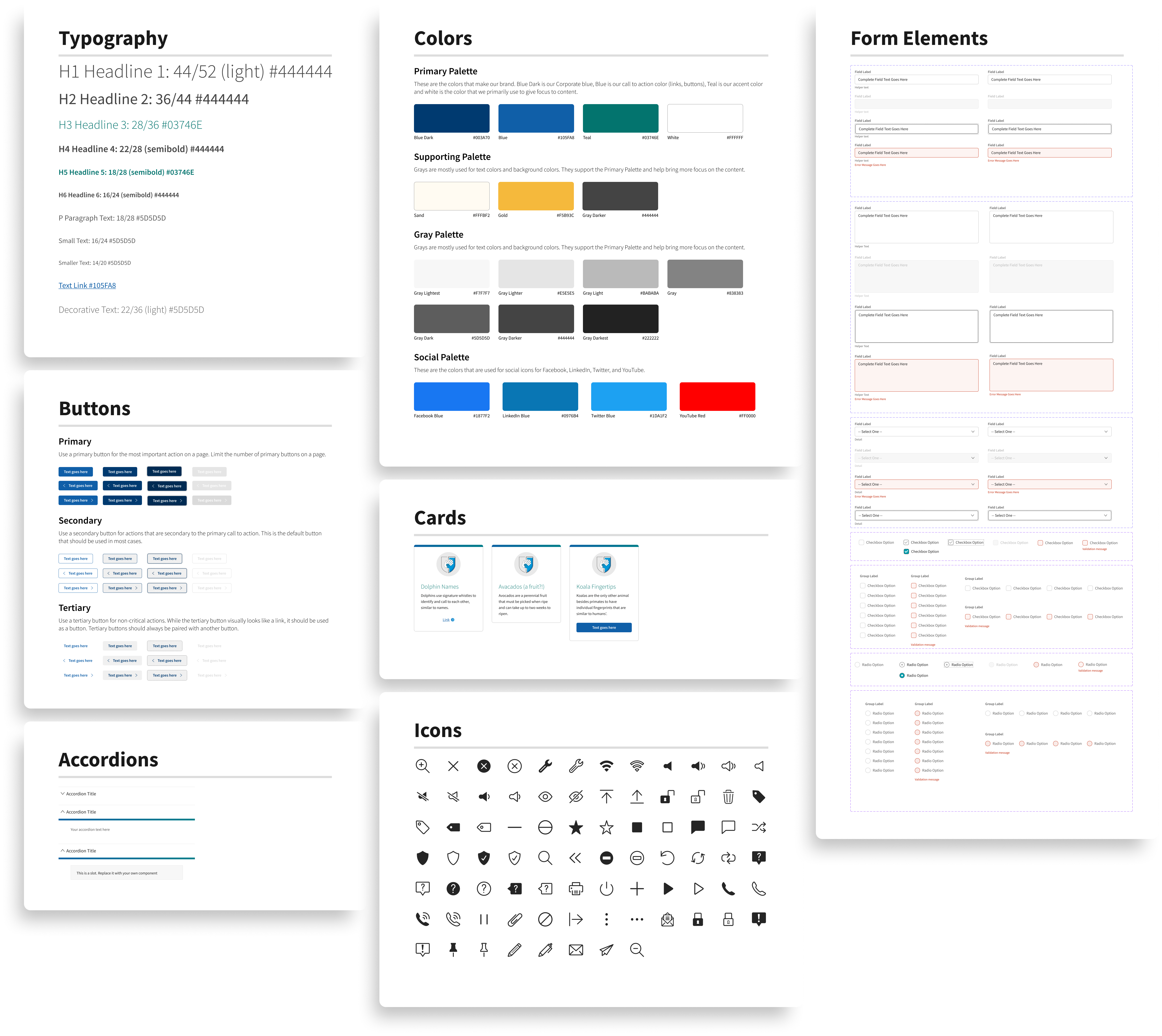
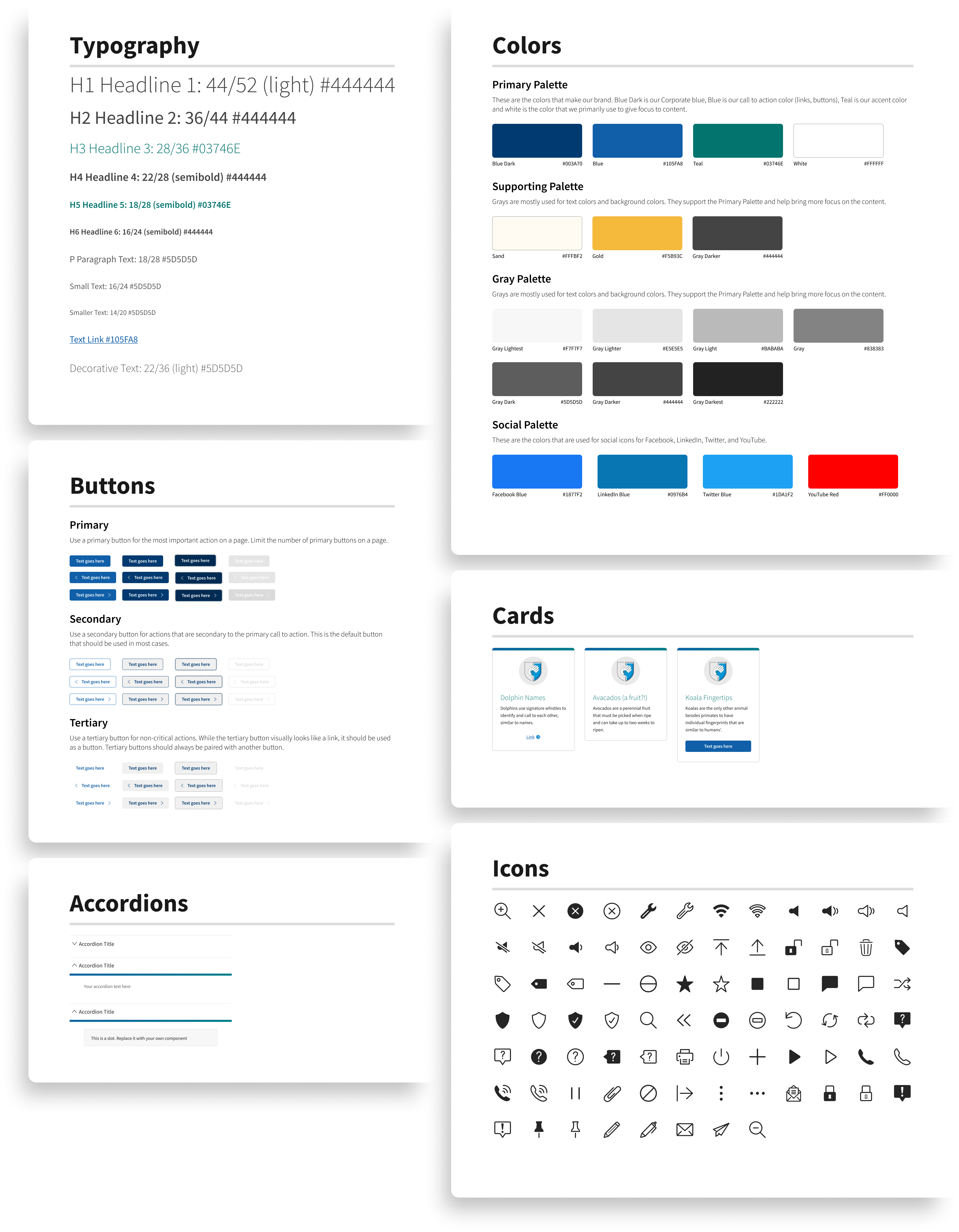
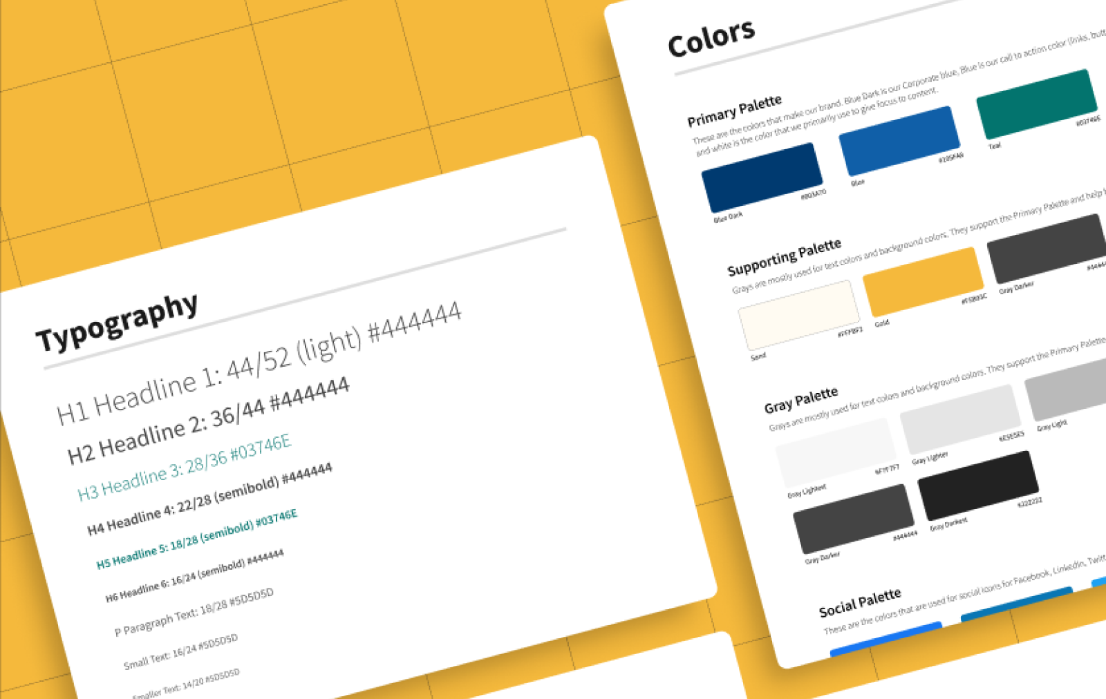
To begin, I wanted to start building out the libraries that would get used by everything: color and typography. Once the color and text styles were created, I would be able to use the styles in the design system components I would build next.
These styles would later evolve to include more colors for brands and a new text style library for our evolving brands. We would need to keep the old text styles for brands that haven't fully caught up to the current design system.
The design components
Switching from Sketch to Figma can be difficult sometimes...because when you try to import a Sketch file to Figma, it (99% of the time) doesn't translate properly. That being said, when trying to intially move components over, I found that none of the components were being built properly.
That could only mean one thing: I have to build them from scratch.
Component Properties and Variants
As stated in the challenges, the largest challenge I wanted to overcome was the immensely high detach rate. To combat this, I built as many options into the component variants as possible, while trying to not overwhelm the designers with too much.
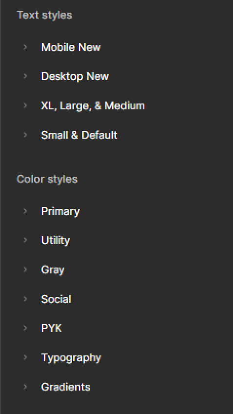
Text and color styles sidebar panel
