Simple Site Redesign
Redesigning the Simplified Issue webpages for Mutual of Omaha
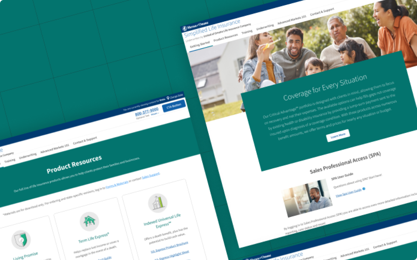
Role: UX Visual Designer
Toolkits used: Figma
Why the redesign?
We needed to move the entire simple site microsite to our internal CMS to align with another project taking place at the same time.
Because of the move, it required a redesign of all existing pages to align with current design standards and systems that were being used by designers.
Challenges
The largest challenge was designing within the component limitations that were set by the CMS. Due to the nature of the components and how the CMS was built, some of the existing designs could not match up closely enough and required a creative workaround.
Designing the pages
There are 6 total pages made with this redesign. Each one received a unique update to make it more cohesive and function better than before.
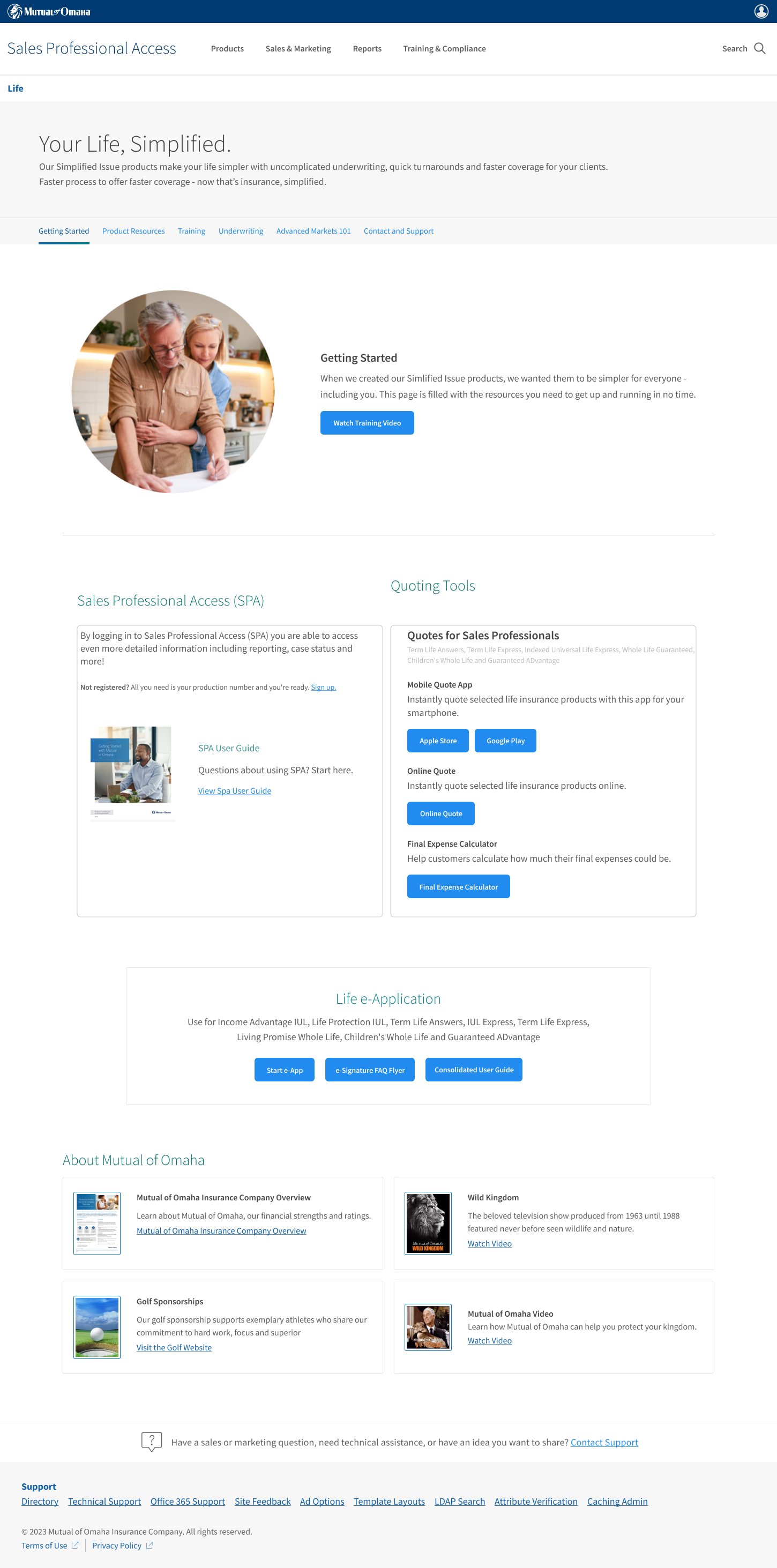
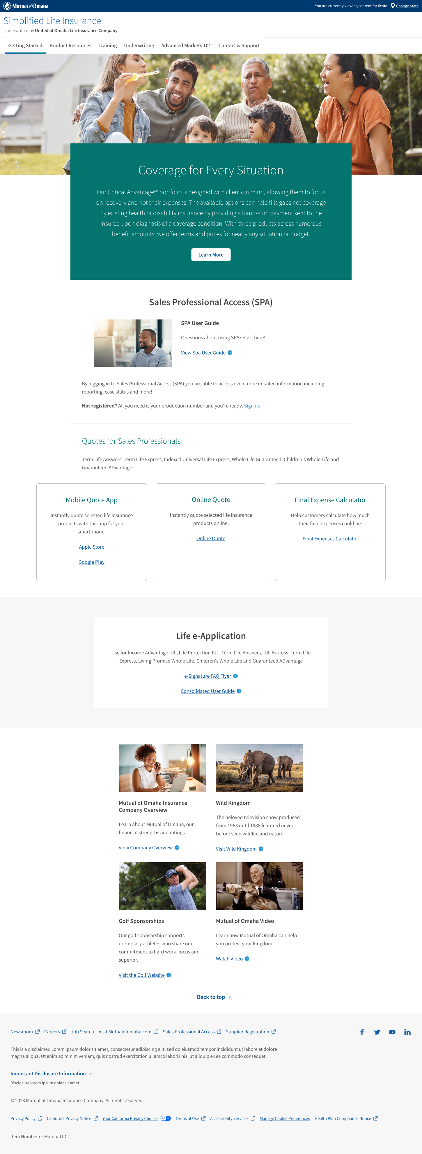
Main landing page
The main page needed a bit more pizzaz. Focusing on pulling out the content a bit, I was able to lay the page out in a way that displays everything in a way that helps the user flow through the page.
Before
After
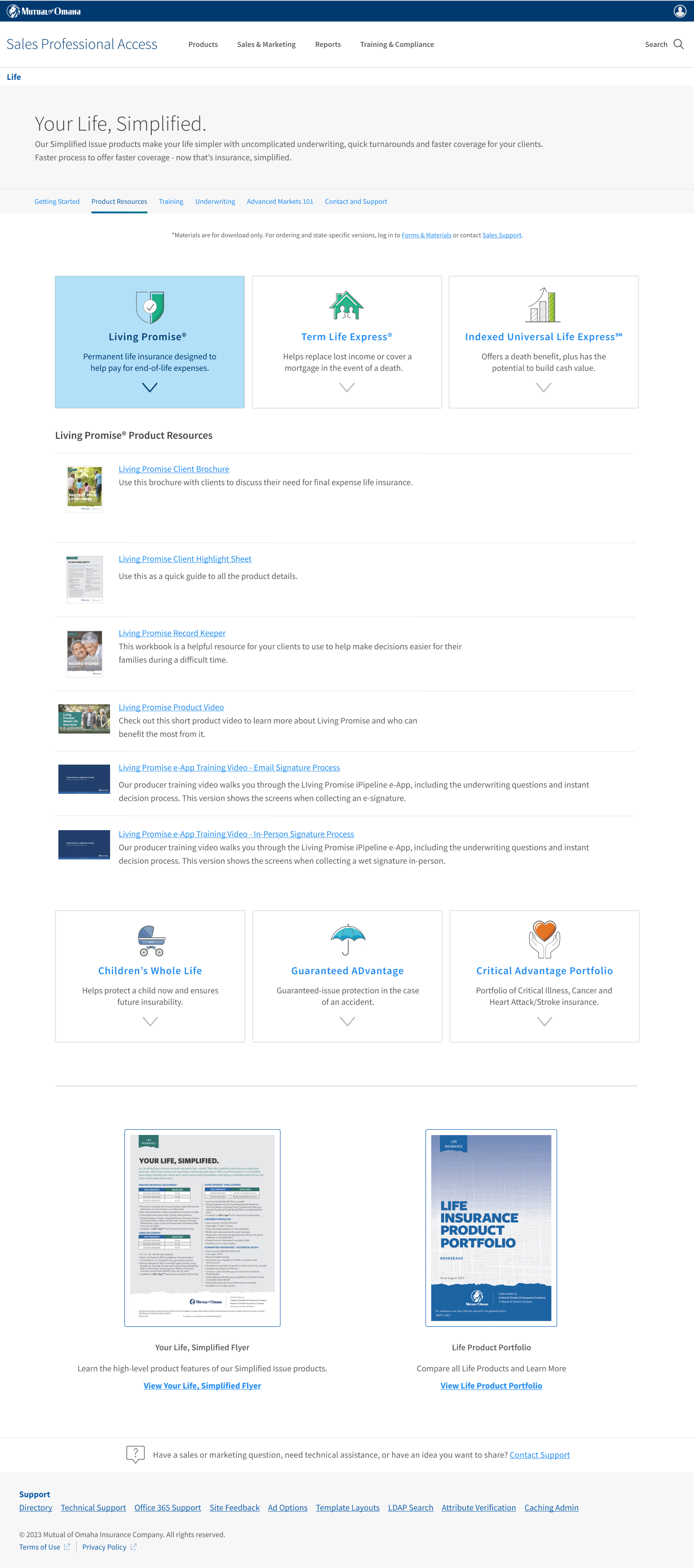
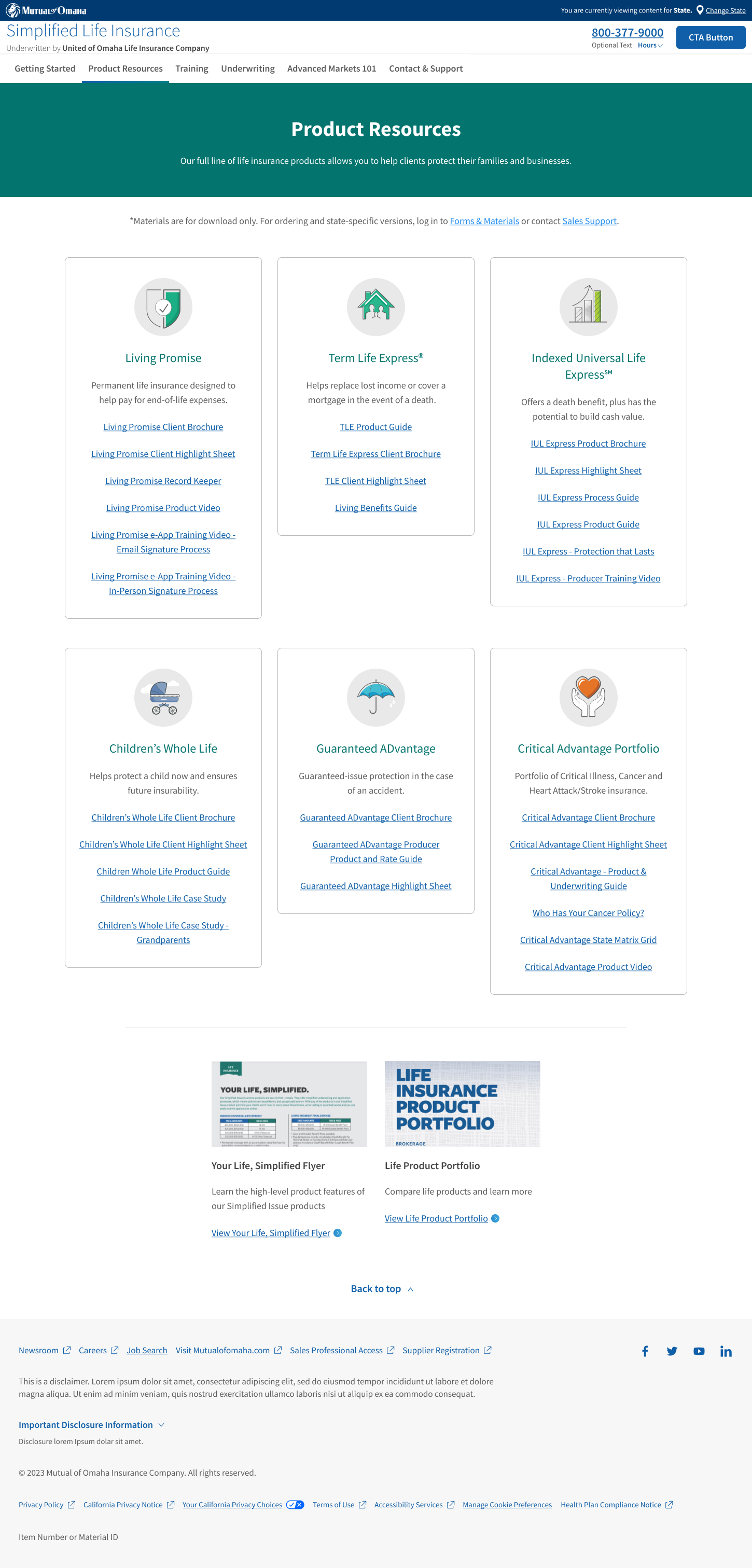
Producer Resources page
One problem that this page faced was some of the links and images under some categories were outdated or didn't work. I removed the images and focused on the categories themselves to make it quicker for producers to get the resources they need.
Before
After
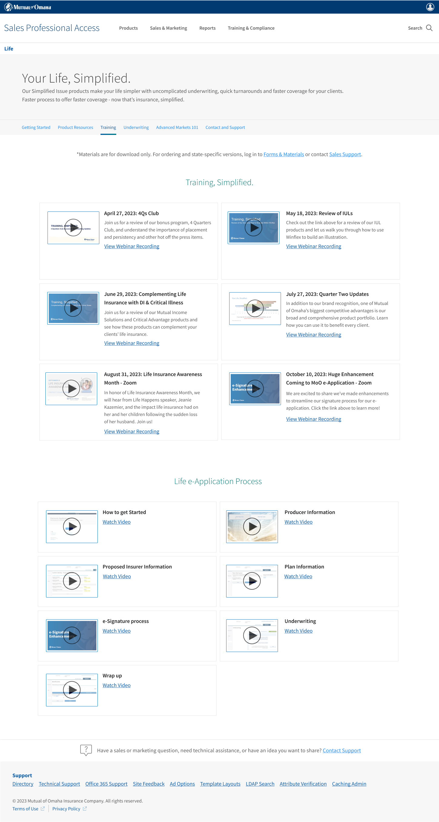
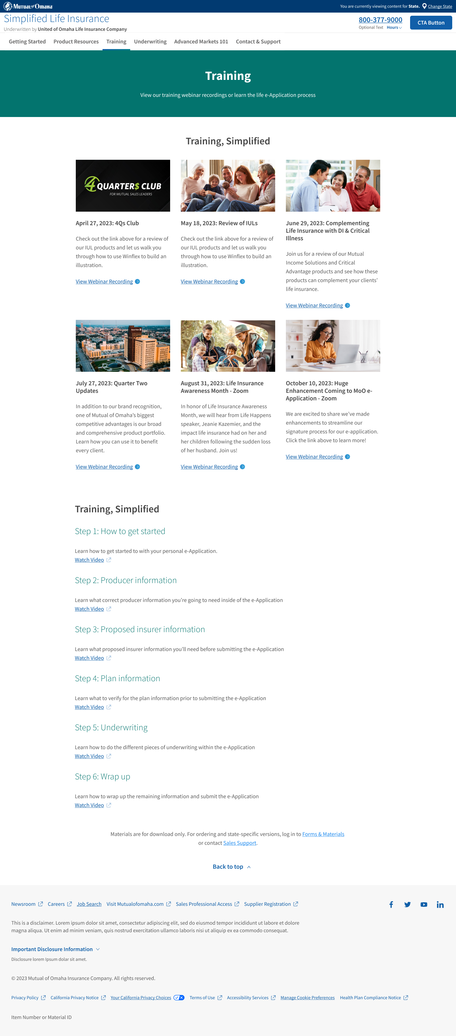
Training page
The training page lacked any type of meaningful imagery. Adding in imagery that helped each category shine helped bring the page to life and stacking content under it made it easier to read.
Before
After
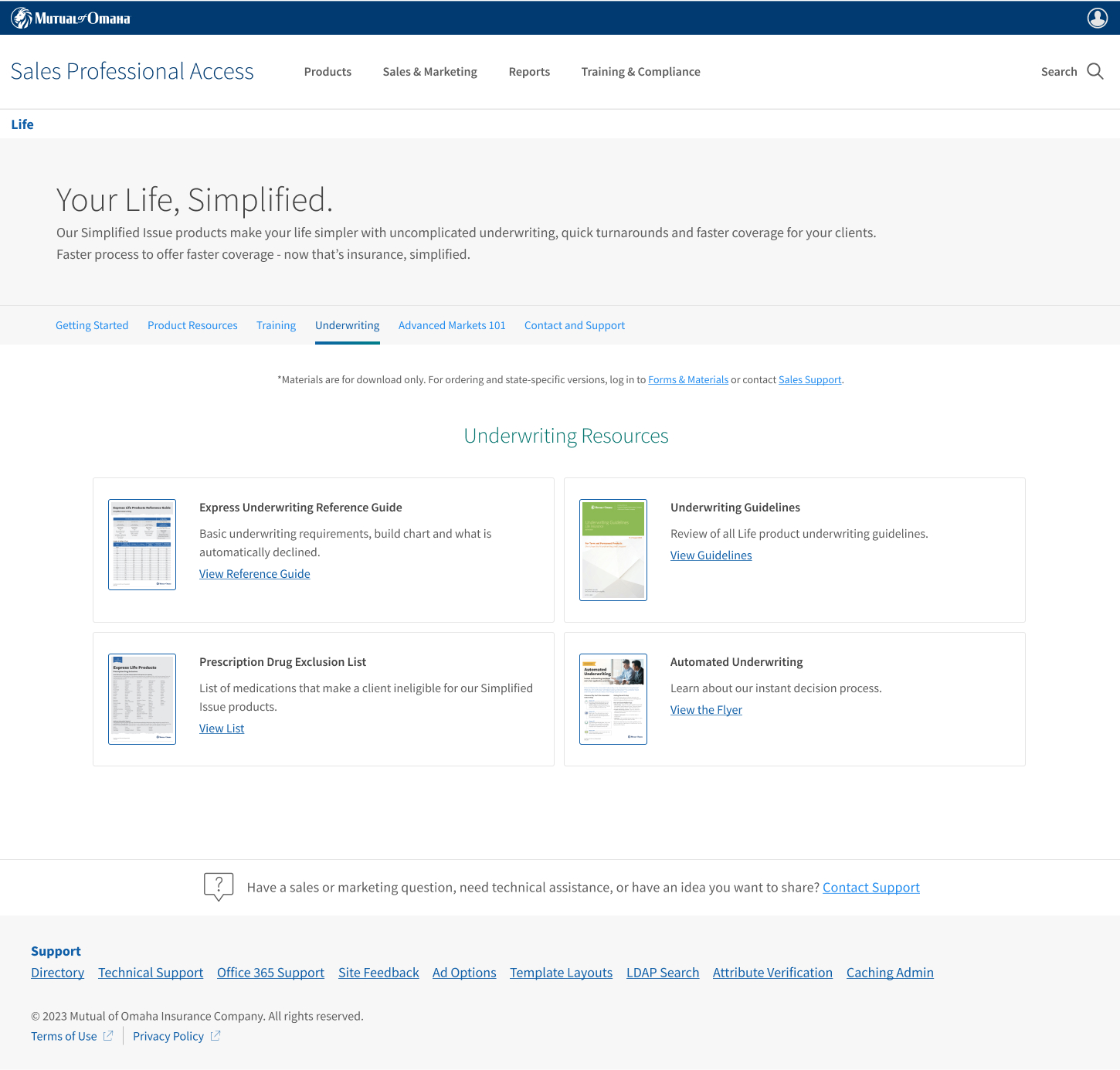
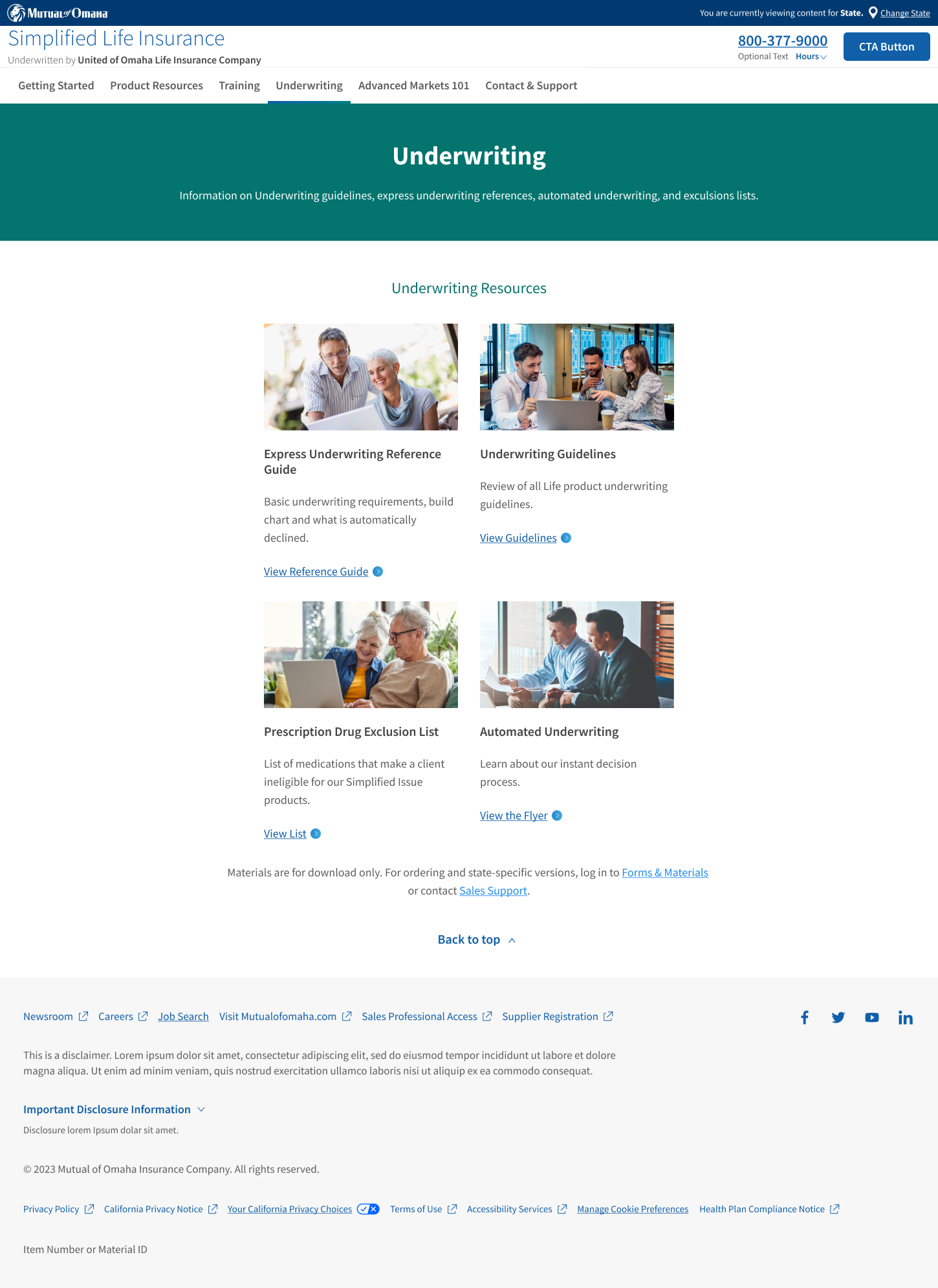
Underwriting page
Similar to the training page, this page also lacked imagery that would engage our users. I updated the sections to include imagery and follow the same structure as the training page, as the content was very similar.
Before
After
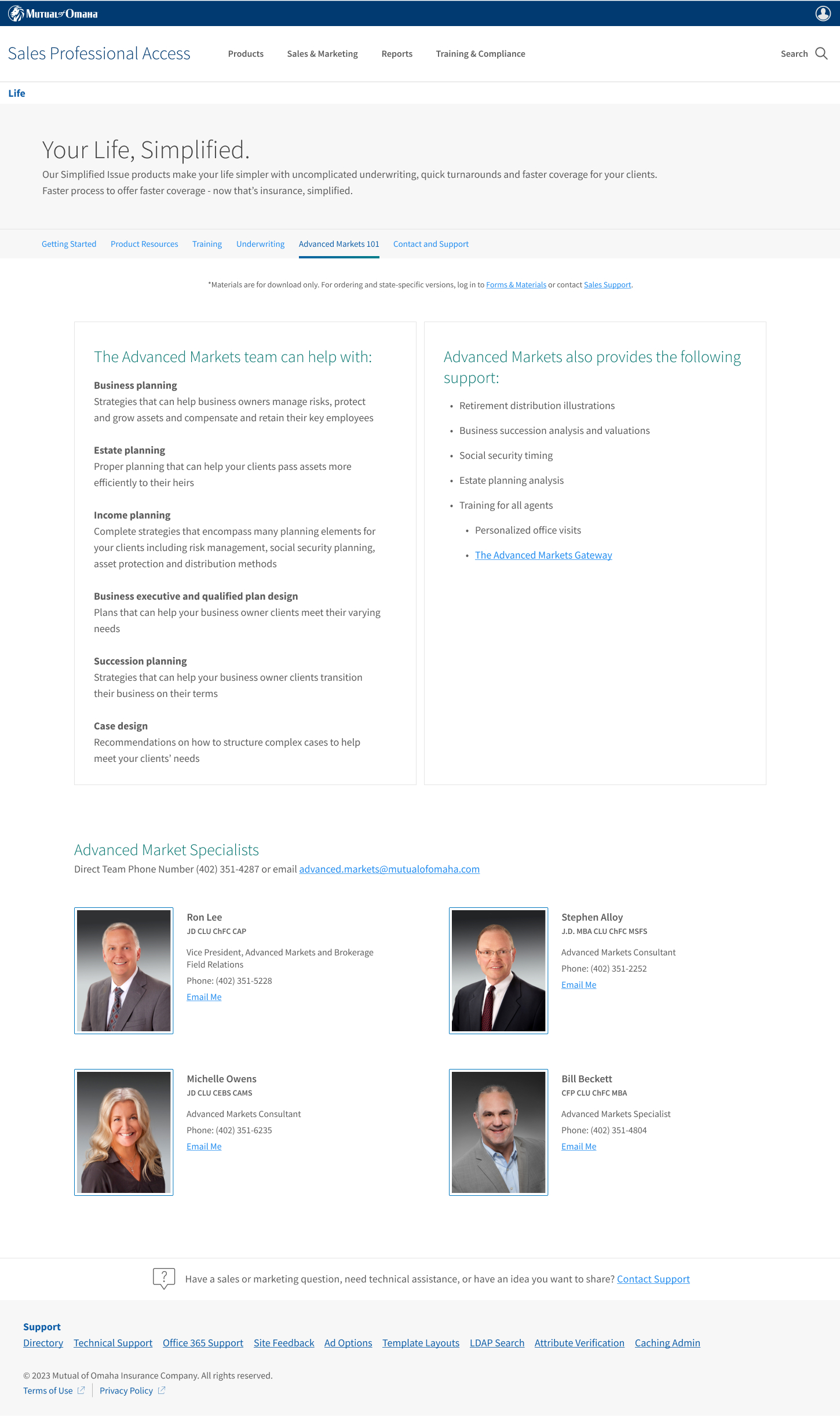
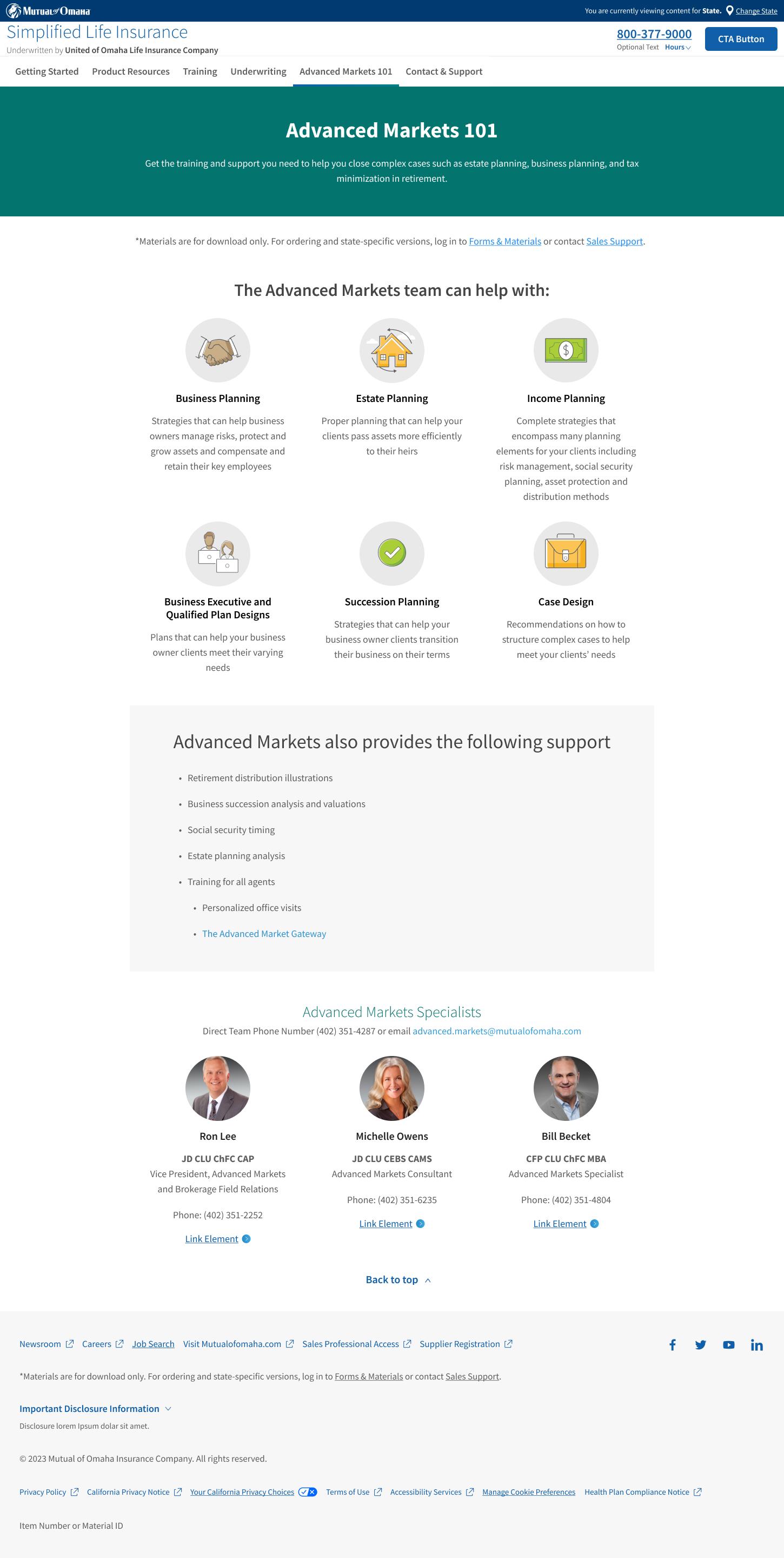
Advanced markets page
I wanted to really bring out the different sections of the advanced markets page. This page was meant to be more informative about what Advanced Markets is, and the way that it was designed prior didn't help differentiate and explain what it COULD be.
Before
After
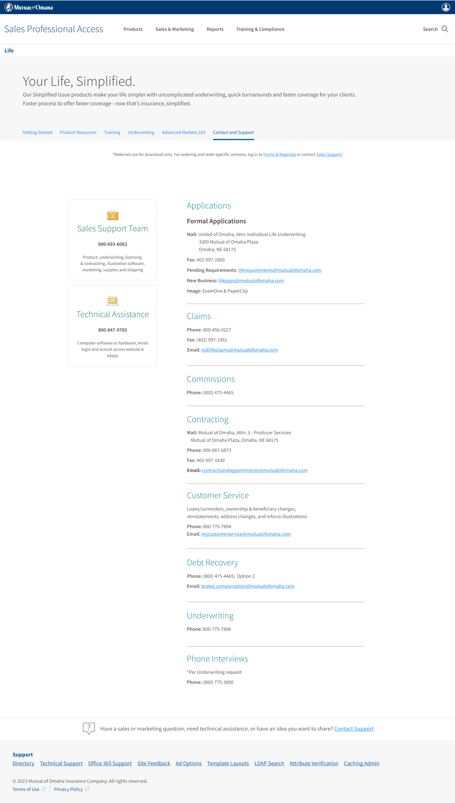
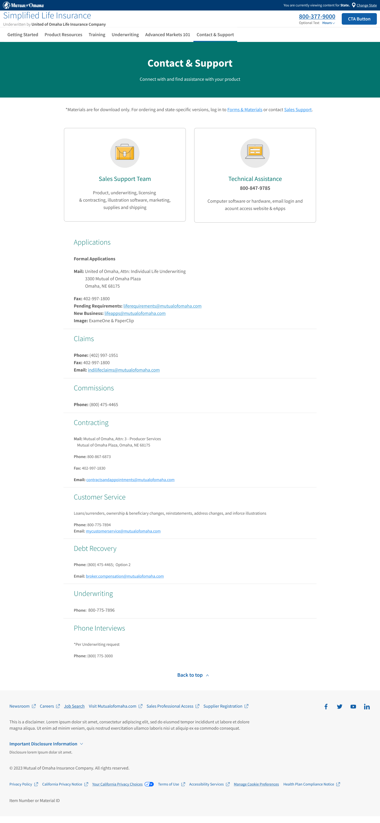
Contact page
This is the page that underwent the least amount of changes. I focused on prioritizing our most important sections (sales support and technical assistance) as analytics showed they were the most used and looked at.
Before
After
Final thoughts
The redesign was a much needed piece of work. The designs help all of the pages engage the users and make it easier for our producers find the information they seek.
